CSS units for responsive website

Introduction
Responsive web design is no longer optional—it's essential. With over 60% of global web traffic now coming from mobile devices, your site needs to adapt seamlessly to every screen size. But here's the kicker: the key to this flexibility lies in something as basic as CSS units—the building blocks that control the size, spacing, and layout of nearly every element on your site.
You’ve probably heard of pixels (px) and percentages (%), but what about viewport-relative units (vw, vh) or the powerful rem? As a web designer or developer, understanding these units isn’t just a nice-to-have skill—it’s critical to creating a smooth, responsive experience for your users. Imagine a site that looks pixel-perfect on a desktop but falls apart on a mobile screen. We’ve all been there, right? It’s frustrating.
In this guide, we’re diving deep into how to use CSS units intelligently. We’ll explore when to rely on fixed units for control and when to embrace fluid units for flexibility. By the end, you’ll have actionable insights that you can apply right away to make your designs more adaptable, more user-friendly, and, let’s be honest, more impressive. Let’s get into it!
Absolute Units: Pixels (px)
Pixel-based units are a fundamental part of the CSS toolkit, providing a fixed and predictable way to size elements on the web. Unlike some more relative units we'll explore, pixels (px) are an absolute measurement, meaning their size remains constant regardless of the device or screen size. This fixed nature of pixels offers several advantages. Designers and developers can precisely control the dimensions of elements, ensuring a consistent layout and visual hierarchy across the page.
Pixel-based units are particularly useful for elements that should maintain a specific size, such as icons, buttons, or other UI components that require a consistent appearance.
However, the very quality that makes pixels useful in certain scenarios – their fixed nature – can also be a limitation when it comes to responsive design. As screen sizes and resolutions vary widely across devices, a layout that looks perfect on a large desktop monitor may appear cramped or disproportionate on a smaller mobile screen when relying solely on pixel-based units.
This is where the concept of responsive design comes into play.
By combining pixel-based units with other relative units and leveraging the power of CSS media queries, designers can create layouts that adapt and scale gracefully across different devices and screen sizes. This approach allows for the precision of pixels where needed while incorporating more flexible and responsive elements to ensure a seamless user experience.
Relative Units: Percentage (%)
In contrast to the fixed nature of pixels, percentage-based units (%) offer a more flexible and responsive approach to web design. Percentage values are relative to the parent element's size, making them inherently adaptable to changes in the layout.
When using percentage-based units, the size of an element is calculated as a fraction of its parent's dimensions. This means that if the parent element's size changes, the child element will automatically adjust its size accordingly. This property makes percentages particularly useful for creating responsive layouts, where the goal is to have elements scale and adapt to different screen sizes.
Percentage-based units are commonly used for setting the width and height of elements, as well as for positioning and spacing. By using percentages, designers can ensure that the layout remains balanced and proportional, even as the overall size of the page or container changes.
For example, consider a simple two-column layout where each column takes up 50% of the available width. As the viewport size changes, the columns will automatically resize to maintain their relative proportions, ensuring a consistent and visually appealing layout across different devices.
.parent {

  width: 200px;

}

.child {

  width: 50%;
  /* 50% of the parent's width */

  height: 75%;
  /* 75% of the parent's height */

}
Viewport Units:Viewport Width (vw) and Viewport Height (vh)
While percentage-based units are relative to the parent element, viewport-relative units take a different approach. The viewport width (vw) and viewport height (vh) units represent a percentage of the current viewport's width and height, respectively. These units are particularly useful for creating designs that scale based on the overall size of the user's screen or browser window. Unlike percentages that are relative to a parent element, vw and vh units are calculated based on the entire viewport, making them ideal for full-screen or full-height layouts. For instance, setting an element's height to 100vh will ensure that it fills the entire viewport height, regardless of the screen size. Similarly, using 50vw for the width of an element will make it take up half the viewport's width, again adapting to the available space.
Viewport Minimum (vmin) and Viewport Maximum (vmax)
Building on the concept of viewport-relative units, CSS also introduces the viewport minimum (vmin) and viewport maximum (vmax) units. These units represent the smaller or larger of the viewport's width and height, respectively. The vmin unit is calculated as the smaller of the viewport's width and height, expressed as a percentage. This can be useful for creating elements thatscale to fit the available space, regardless of whether the viewport is in portrait or landscape orientation.
Conversely, the vmax unit represents the larger of the viewport's width and height, also expressed as a percentage. This can be beneficial for creating elements that maintain a consistent size relative to the overall viewport, even as the aspect ratio changes.
While not as commonly used as vw and vh, vmin and vmax can be valuable tools in certain responsive design scenarios. They provide an additional level of control and flexibility, allowing designers to fine-tune the scaling and positioning of elements based on the viewport's dimensions.

Font-relative Units: Em (em) and Rem (rem)
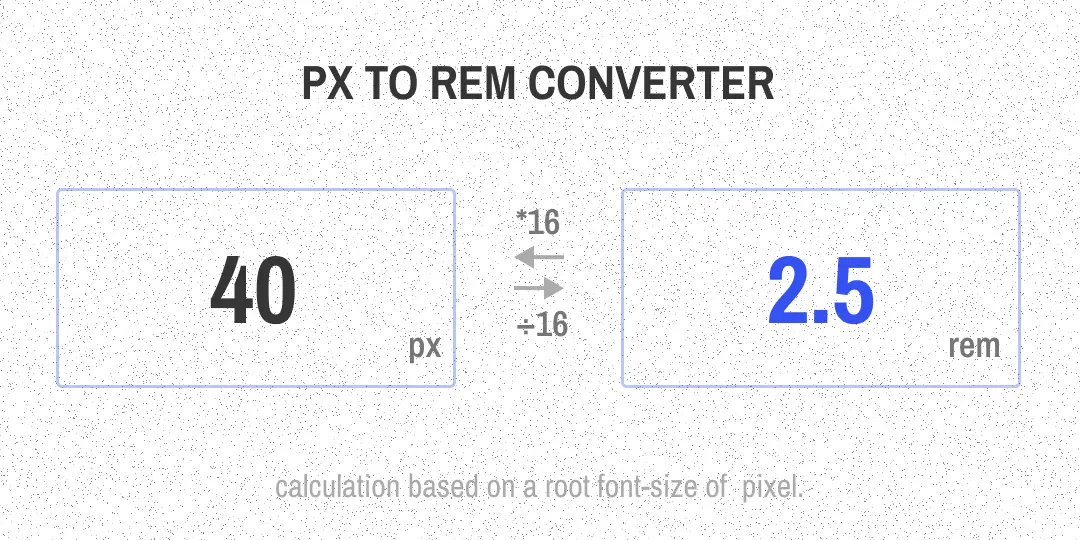
In addition to the viewport-relative and percentage-based units, CSS also offers font-relative units that are based on the size of the text. These units, known as em (em) and rem (rem), provide a way to create designs that scale in proportion to the typography. The em unit is relative to the font size of the element itself. This means that if an element has a font size of 16 pixels, and you set its width to 2em, the width will be 32 pixels (2 x 16). This makes em units particularly useful for creating designs where elements should scale based on the font size, such as in typography-heavy layouts or when ensuring consistent spacing and sizing around text.The rem unit, on the other hand, is relative to the root element's font size, typically the html element. This provides a more consistent reference point for sizing elements across the entire document, as changes to the root font size will be reflected in all rem-based measurements. The key difference between em and rem is the scope of their relativity. Em units are relative to the local context, meaning that their size can vary depending on the font size of the parent element. Rem units, however, maintain a consistent reference point, making them easier to work with in complex, nested layouts.
.parent {

  font-size: 20px;

}

.child {

  width: 2em;
  /* 2 times the font size of the parent */

  height: 1em;
  /* 1 times the font size of the parent */

}
html {

  font-size: 16px;

}

.example {

  width: 5rem;
  /* 5 times the root font size */

  height: 2rem;
  /* 2 times the root font size */

}
Both em and rem units are valuable tools for creating responsive and accessible designs. By basing the sizing of elements on the typography, designers can ensure that the layout scales harmoniously as the user adjusts their browser's text size or zooms in and out of the page. Viewport-Relative Units: Pixel (px)
While traditionally considered an absolute unit, pixel-based units (px) can also play a role in responsive design when used in conjunction with other CSS features, such as media queries and breakpoints.
The key to using pixels responsively lies in the ability to specify different pixel values for different screen sizes or device types. By leveraging CSS media queries, designers can define breakpoints that trigger changes in the layout, including adjustments to element sizes measured in pixels.
For example, a designer might set the font size of a heading to 24px on desktop screens, but then use a media query to reduce it to 18px on smaller tablet screens and 16px on mobile devices. This allows for precise control over the visual hierarchy and readability of the content, while still ensuring a responsive and adaptable layout.
Similarly, pixel-based units can be used for setting the dimensions of UI elements, such as buttons or icons, to ensure they maintain a consistent size and appearance across different screen resolutions. By defining specific pixel values for each breakpoint, designers can create a cohesive and polished user experience that adapts to the user's device.
It's important to note that the use of pixel-based units in responsive design should be balanced with the incorporation of more flexible, relative units. Relying too heavily on fixed pixel values can limit the overall responsiveness of the layout and make it more challenging to accommodate a wide range of devices and screen sizes.
Combining Absolute and Relative Units
In practice, the most effective responsive designs often involve a combination of absolute and relative units, leveraging the strengths of each to create a balanced and adaptable layout.
For example, a designer might use pixel-based units (px) for setting the font size of headings and body text, ensuring a consistent typographic hierarchy. They could then use percentage-based units (%) for the width and positioning of layout elements, allowing them to scale and adapt to changes in the viewport size.
Viewport-relative units (vw, vh, vmin, vmax) can also be incorporated, particularly for creating full-screen or full-height layouts, or for setting the size of elements that should scale proportionally to the viewport.
Finally, font-relative units (em, rem) can be used to ensure that the spacing and sizing of elements around text maintain a harmonious relationship with the typography, even as the overall layout adapts to different screen sizes. By thoughtfully combining these various units, designers can create responsive designs that are both visually appealing and highly functional across a wide range of devices. The key is to understand the strengths and limitations of each unit, and to apply them strategically to achieve the desired balance of precision, flexibility, and responsiveness.
Conclusion
In the ever-evolving landscape of web design, the choice of CSS units plays a crucial role in creating responsive and adaptable layouts. From the fixed nature of pixels (px) to the relative flexibility of percentages (%), viewport-based units (vw, vh, vmin, vmax), and font-relative measurements (em, rem), each unit offers unique advantages and use cases.
By mastering the nuances of these CSS units, designers and developers can craft web experiences that seamlessly scale and adapt to the diverse range of devices and screen sizes used by modern audiences. Whether it's ensuring precise control over UI elements, creating responsive layouts that flow naturally across viewports, or maintaining a harmonious relationship between typography and design, the strategic application of these units is essential for delivering high-quality, responsive web experiences.
As the web continues to evolve, the importance of understanding and effectively utilizing these CSS units will only grow. By embracing this knowledge, designers and developers can future-proof their work, ensuring that their creations remain visually stunning, functionally robust, and accessible to users across the entire spectrum of devices and screen sizes.


