Finding the Perfect Look :A Friendly Guide to Choosing Fonts in Web Design

Introduction:
Ever wonder why some websites feel so inviting, while others leave you squinting at the screen? The secret often lies in the choice of fonts. Let's embark on a journey through the art of selecting fonts in web design, making sure your website not only looks good but feels just right...
Getting to Know Your Website's Personality:
-
Expressing Brand Vibes:
Choose fonts that align with the brand's personality. A law firm might opt for a classic serif font, while a trendy startup might prefer the sleek and modern sans-serif look.
-
Knowing Your Audience::
Consider the age group and preferences of your audience. A young crowd might dig cool, innovative fonts, while a more mature audience might appreciate a touch of timeless elegance.
Font Families: Serifs, Sans-Serifs, and the Show-Stoppers:
-
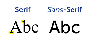
Serifs:
Serifs are like the little black dress of fonts – traditional and classy. They're great for websites that want to exude authority and a touch of tradition.
-
Sans-Serifs:
Sleek and modern, sans-serifs are like the comfy jeans of fonts. Perfect for contemporary designs and easy on the eyes, especially on digital screens.
-
Display Fonts:
These are the rockstars of fonts, stealing the show in headlines and titles. Just be cautious – too much of a good thing can be overwhelming in body text.

Keeping It Easy to Read:
-
Font Size Matters:
It's like choosing the right font for your friend's birthday card – not too big, not too small. Aim for a size that lets your visitors read comfortably without squinting.
-
Spreading Out the Lines:
Nobody likes a cramped party, and the same goes for text. Make sure your lines have enough space to breathe, creating a reading experience that feels just right.
Staying in Style: Consistency Is Key:
-
Fewer Fonts, More Fun:
Imagine your fonts as a close-knit group of friends – they get along well, and the party looks great. Stick to a few font families to keep things cohesive and avoid a font showdown.
-
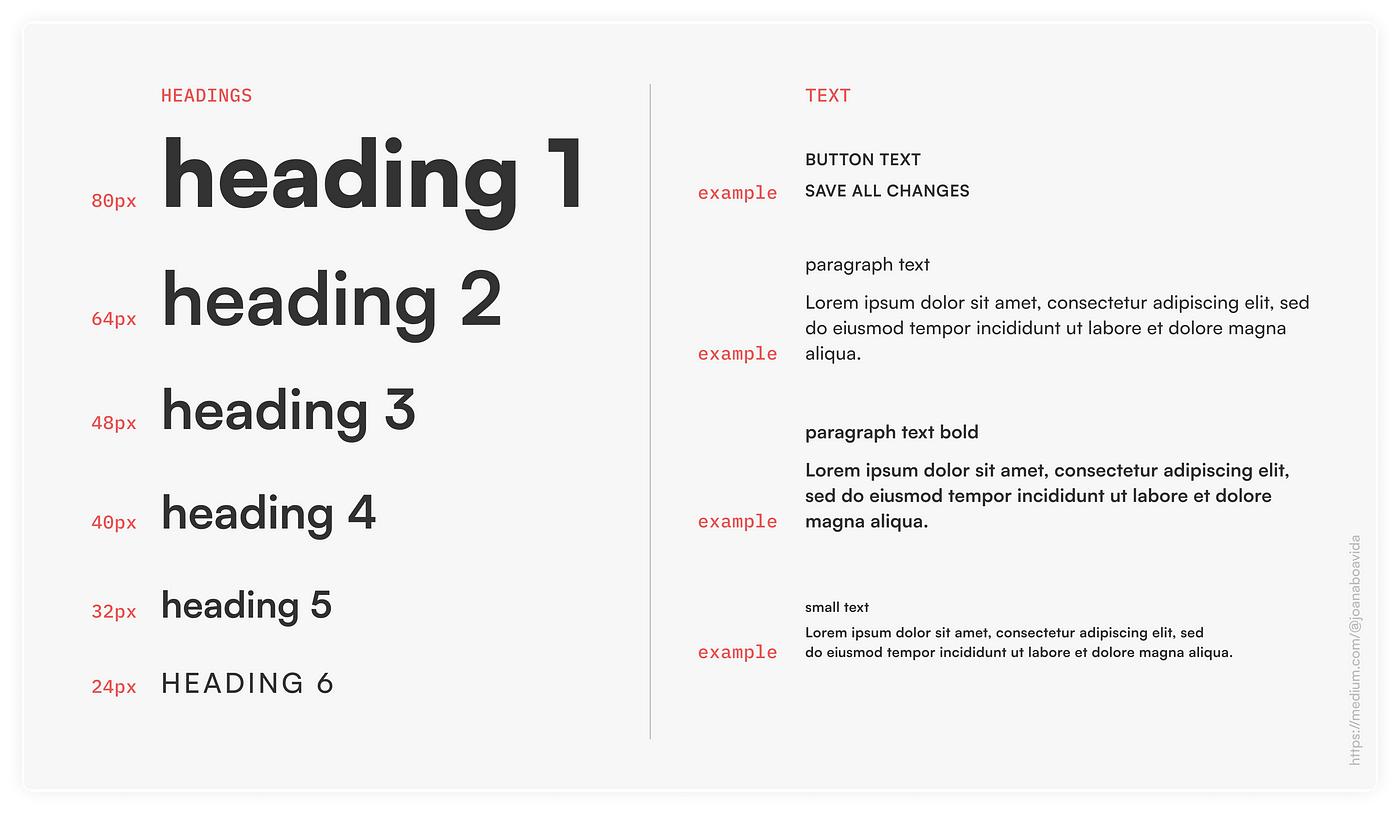
Font Hierarchy:
Font Hierarchy: Think of your fonts as a family tree – each one has a role. Headers, subheadings, and body text should have their own distinct look, creating a visual hierarchy that guides your visitors through the content.

Trial and Error: Test-Driving Your Fonts:
-
Browser Compatibility:
Fonts are a bit like clothes – they might look different depending on where you wear them. Test your fonts on different browsers to ensure they look good everywhere.
-
Accessibility:
Not everyone has 20/20 vision, so make sure your fonts are friendly to everyone. Choose fonts that are easy to read, and don't forget about color contrast for a warm welcome to all visitors.
Going with the Flow: Trends and Timelessness:
Staying Stylish: While it's tempting to follow the latest trends, think of your fonts like a classic leather jacket – they should age well. Aim for a timeless appeal that stands strong even as design trends come and go.
Conclusion:
Picking fonts for your website is like creating the perfect playlist for a gathering – it sets the mood and makes everyone feel at home. By considering your brand, audience, readability, and maintaining a sense of style, you'll find the ideal combination that gives your website a look and feel that's just right. After all, the perfect font isn't just about aesthetics – it's about making your message shine in a way that resonates with your audience. Cheers to finding the font that feels like home!


